This chart is built around two ordered lists of the percentages of Anglo non-Hispanic population and of minority population in each of 36 new congressional districts in Texas. The minority percentage used is for all minorities, including Asian. This anatomy is done on C235, the redistricting plan mandated by the courts to replace C185 which was the plan passed by the Texas Legislature. Plan C185 was thrown out by the first courts to review it. Plan C235 was ordered by those courts to remedy this, but notice how bad C235 still is!! On appeal the courts in Washington have now agreed with the lower court ruling and have judged PlanC185 to not have been drawn "without discriminatory purposes." An anatomy of C185 has been completed and is now online at http://dallasredistricting2011.blogspot.com/2012/08/texas-congressional-redistricting-plan.html .
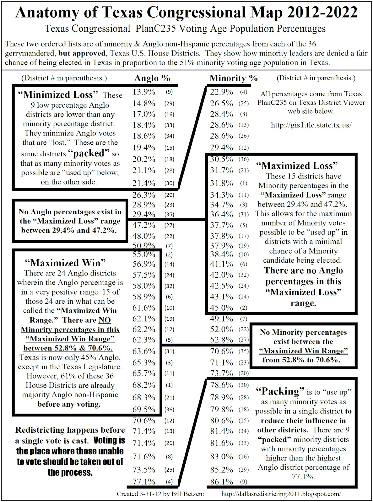 |
| Anatomy of Texas Congressional Map for 2012-2022 Right-click to enlarge and/or print. |
Except for the Texas Legislature itself, Texas is only 45% Anglo. But, due to classic gerrymandering, Anglos are the majority in 61% of districts, before there is even an election. In elections Anglo percentages have historically gone up due to both the legal inability for some minority residents to vote combined with apathy induced by generations of adverse gerrymandering against minorities, such as that illustrated in these charts. This history is combined with other methods used over the generations to discourage minority voting, most of which have since been declared unconstitutional. Voter-ID laws in Texas are now planned to add to the collection of methods used to minimize minority voting.
While there are no districts with Anglo percentages in the "Maximize Loss" range between 47.2% and 29.4%, there are 15 minority districts with percentages in that same "Maximize Loss" range. See the chart above. In a similar manner, while there are no minority percentages between the most favorable section of the "Maximized Win" range from 52.8% to 70.6%, there are 15 districts with Anglo percentages in that most favorable range. Why? Could this have happened by accident? The scattergraph below is another illustration of this same gerrymandered manipulation of Texas Congressional Maps. It will continue to deny equal representation to minorities until 2022.  |
| Scattergraph of Gerrymandered Texas Congressional Map, PlanC235 Right click above chart to enlarge and/or print. |
Please print and share the above charts with anyone interested in voting rights and equality of opportunity. Both these charts were made from demographic data on the U.S. House Districts created and approved by the Texas Legislature. This data is from PlanC235 found in the Texas DistrictViewer, online at http://gis1.tlc.state.tx.us/. The above charts were done in an attempt to illustrate the evil that "gerrymandering-gone-wild" has again done to Texas for the next decade.
In 2020 our nation will start another redistricting process. Hopefully every jurisdiction will have the redistricting process online and available to citizens so that everyone can more easily see what is happening. Transparency is our best weapon in the war against gerrymandering. But it will only work if more citizens are involved.
Questions are welcome, especially if any technical errors are noted on these charts, or if you want a pdf copy of these charts for a better quality print.
Bill Betzen
bbetzen@aol.com